SUMMONER’S SCREEN
PROJECT OVERVIEW
The concept was presented to me by a MacOS developer who had an idea of an app with the ability to edit desktop wallpapers, live wallpapers, lock screen wallpapers, and screensavers.
TARGET AUDIENCE
NICHE
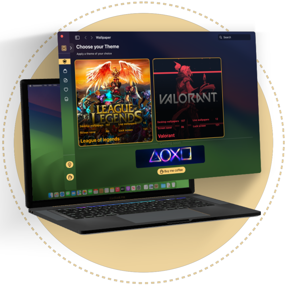
The app’s niche was a gamer theme. Instead of users downloading multiple images, creating folders, and relying on native features for customisation, the app would streamline the process. It would source assets based on the customer’s preferences and theme choice, providing a curated pool of gaming-themed wallpapers and screensavers.
MOTIVATION
Given that the functionality exists natively on macOS, the goal of the app was to provide an appealing user interface and improve asset management. The app would handle downloading and managing the selected assets while offering a niche collection of wallpapers and screensavers
Research and Inspiration
To better understand the audience, we run a poll and a survey, which highlighted the current shortcomings of the native experience and the desire for game themed wallpaper. This also highlighted the specific games the participants wish to have and don’t have access to. This informed our choice on the first themes to roll out
With a clear understanding of the shared vision between the developer and me, it was up to me to deliver the visual aspect of the application.
Design Process
With the identified shortcomings in mind, it was clear that the app needed to be simple yet scalable to adequately serve the target audience and niche.
The key features included:
1. Customisation Capabilities:
2. Asset Management:
3. User Engagement:
Allow suggestions for future game themes to host. Support and contribution options.


4. Advanced Filtering:
Enable users to filter assets by keywords, such as characters within supported themes.
5. Collection Management:
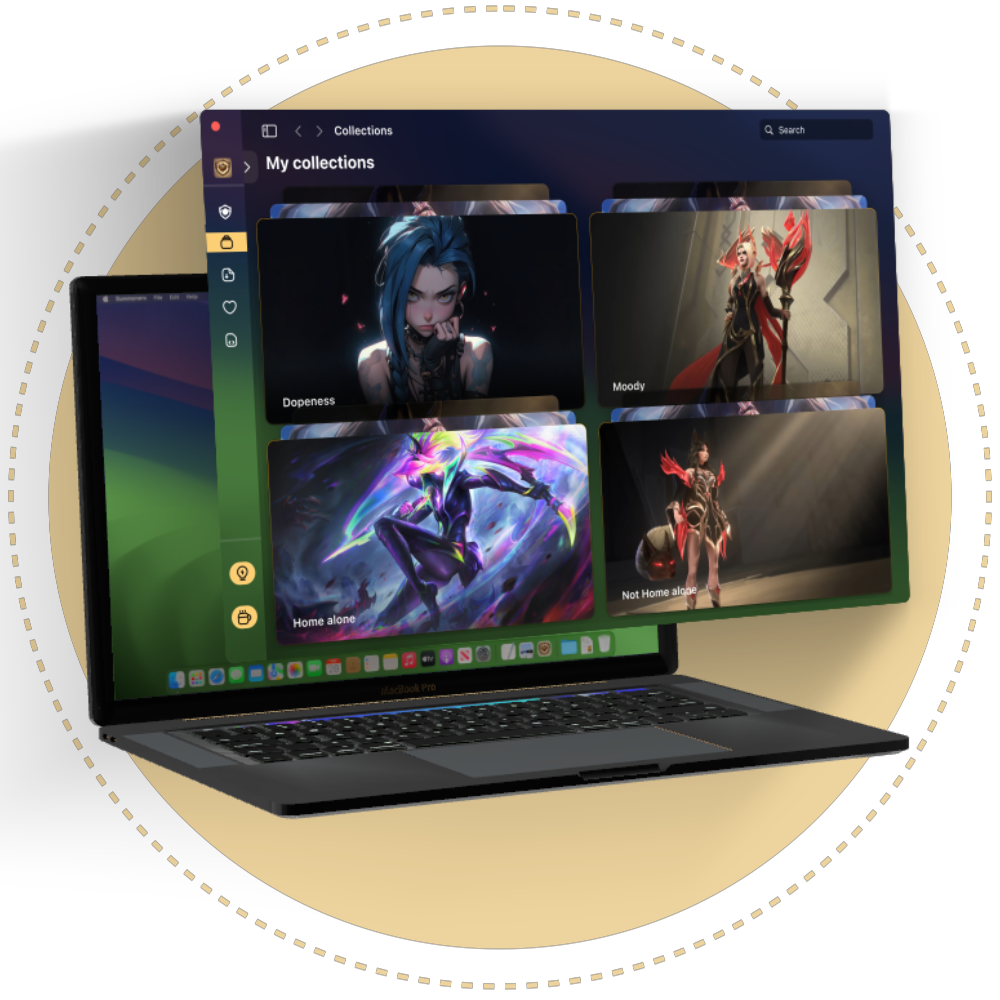
Allow users to create and maintain their own collections.
6. User Interface Options:
The ability to edit desktop wallpapers, live wallpapers, lock screen wallpapers, and screensavers.
7. Customisation Intervals:
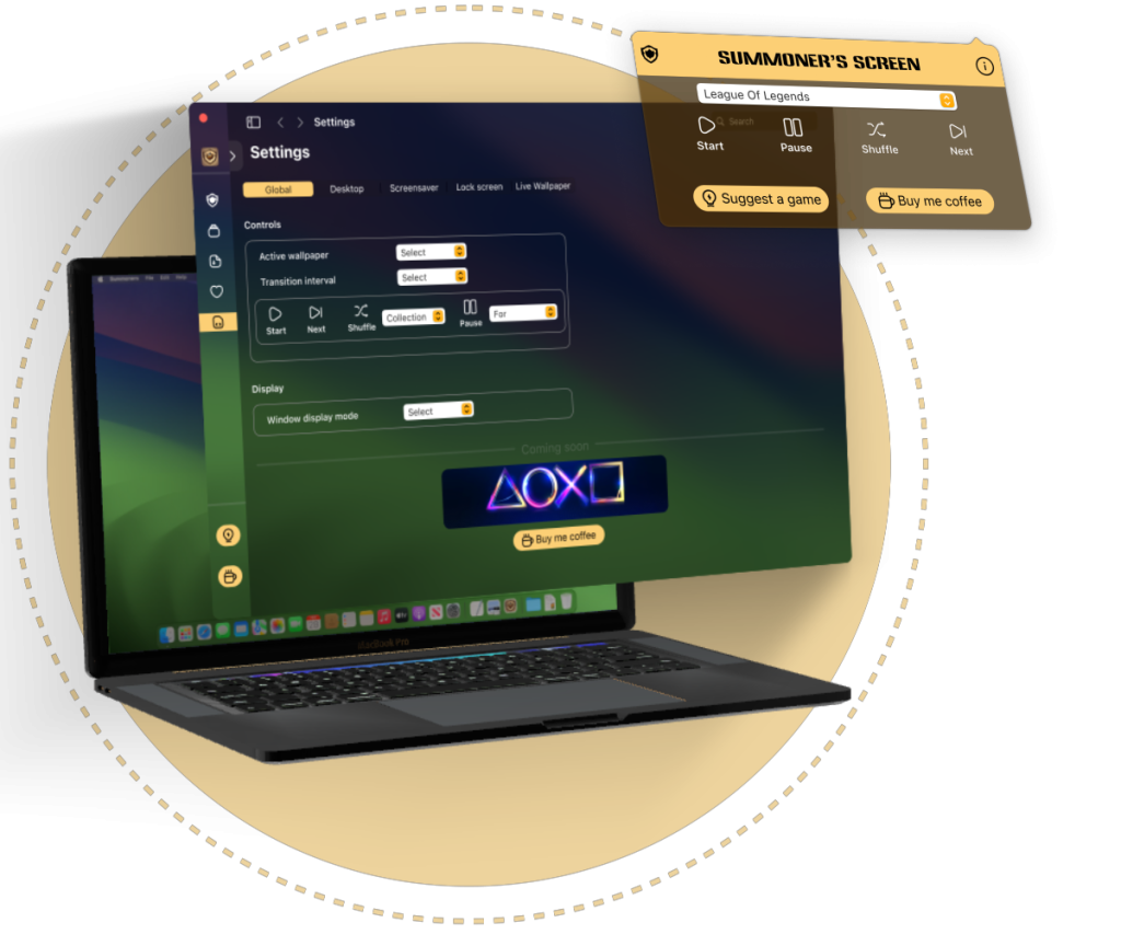
Customise intervals for each asset type or set a global interval for all.
8. Ease of Use:
Include a widget to simplify the customisation process.”
9. Quality Navigation and Responsive Interaction:
Ensure high-quality navigation and responsive interaction throughout the app to enhance the user experience.

Wireframes
The initial concept was created by the project’s developer, who focused on exploring the app’s functionality. As the process progressed, it became clear that the interaction and design needed to be mapped out and visualised. He shared a skeleton of his vision, and it was up to me to bring it to life—both visually and in terms of motion.
The UI was designed to be very simple, with a focus on making it visually appealing.
I sketched the basic layout and necessary pages, evaluating the quality of interaction and navigation. Satisfied with the initial concepts, I decided to skip low-fidelity designs and moved directly to high-fidelity designs and styling.
UI/UX Design:
I compiled a list of the necessary assets and created interactive components. The interactivity of these components was critical, as it played a significant role in developing a prototype for proof of concept
Design & Prototyping
To ensure a high-quality navigation and responsive interaction throughout the app, I created a prototype to simulate the navigation and present the motion concept of the app, enhancing the user experience. Due to the limitations in prototype animation, I kept close contact with the developer to progressively define the motion, using action-specific prototypes and animated videos for clear sharing of the motion vision
Give it a try, click and explore away on the prototype below… 😉

Color
RGB :
CYMK :
HSL :
FCCF75
2, 17, 57, 1
40, 96, 72
Typography
Aa
SF Pro
Aa
ANKLEPANTS
RGB :
CYMK :
HSL :
FCCF75
2, 17, 57, 1
40, 96, 72
Reflection
I compiled a list of the necessary assets and created interactive components. The interactivity of these components was critical, as it played a significant role in developing a prototype for proof of concept
Challenges
The main challenge in this project was gaining experience with designing for macOS, as my previous design work was primarily for web applications. This required additional research and exposure to understand the specific design principles and patterns associated with macOS.
Testing and Iteration
We tested the prototype with a few friends initially to gather early feedback. After development, we conducted another round of testing with both participants who had previously experienced the prototype and those new to the concept. This feedback led to several changes that have been incorporated into the app.
Future Development
The app was recently released on the App Store, and we are actively monitoring its performance and user feedback
Conclusion
Personal Growth:
As we monitor the reception of the application, I have been actively observing other app behaviours to identify potential improvements for future releases.
Get it now
