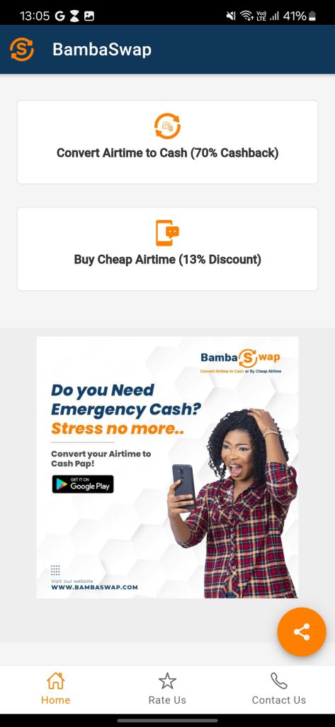
BambaSwap is a Kenyan initiative aimed at providing cheap and convenient solutions for customers who want to convert their airtime to cash or buy cheap airtime, at discounted prices.
This was a nifty initiative because a customer could be in possession of Airtime and wish to convert it to monetary value and use that value to buy or pay for other products and services. The initiative is currently serving Safaricom customers in Kenya, with a bold ambition to venture to other countries and telcos
With that ambition in mind, and an existing proof of concept application in the market, the app needed to evolve, based on the feedback provided and a need for a richer user experience
BACKGROUND
The current app is functional but lacks intuitive and responsive user experience, which is felt most in it’s communication, interaction and navigation within the app
These are experienced in;
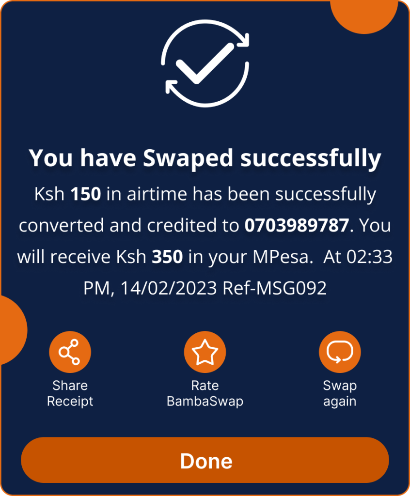
Lack of communication for successful or failed actions taken by the user
Lack of visual aid and feedback for actions taken by the user, leading to some customers repeating an action in doubt
Availability of more than one way to perform the primary action but without a way to bridge them, so once the customer takes one approach, they have to see it through or terminate and try another
Lack of intuitive navigation through the services, leading to a higher learning curve
Lack of a save/remembering aspect leading the customer to perform the same actions each time they come back to perform the action
OBJECTIVES
The primary objective was to solve the above listed issues and improve the user interface while at it. This meant that at the end of it, the user should
Have a visually appealing application
Experience a user friendly experience
Be able to navigate through the app easily
Be informed of the results of their actions
Have feedback and responses to their actions to confirm every interaction they have with the UI
Have the ability to save some information for a more efficient flow in future
Be able change their decisions mid-journey and have the flow accommodate that without having to start a new journey
DESIGN PROCESS
To execute this in the timeline provided, I broke down the essential steps into 4;
1. Ideation
Coming up with the problems and their solutions within the app
2. Wire-framing
Structuring the outcome of the ideation onto a mobile view, keeping in mind they we had existing users who would be migrated to the new UI
3. High fidelity designs
I created a design system in high fidelity and designed the screen as approved by the business owner. At this point walkthroughs were necessary with the business owner and the developers to build the app
4. Prototyping
Once the high fidelity designs were approved, I created an immersive prototype with made the high fidelity designs more practical
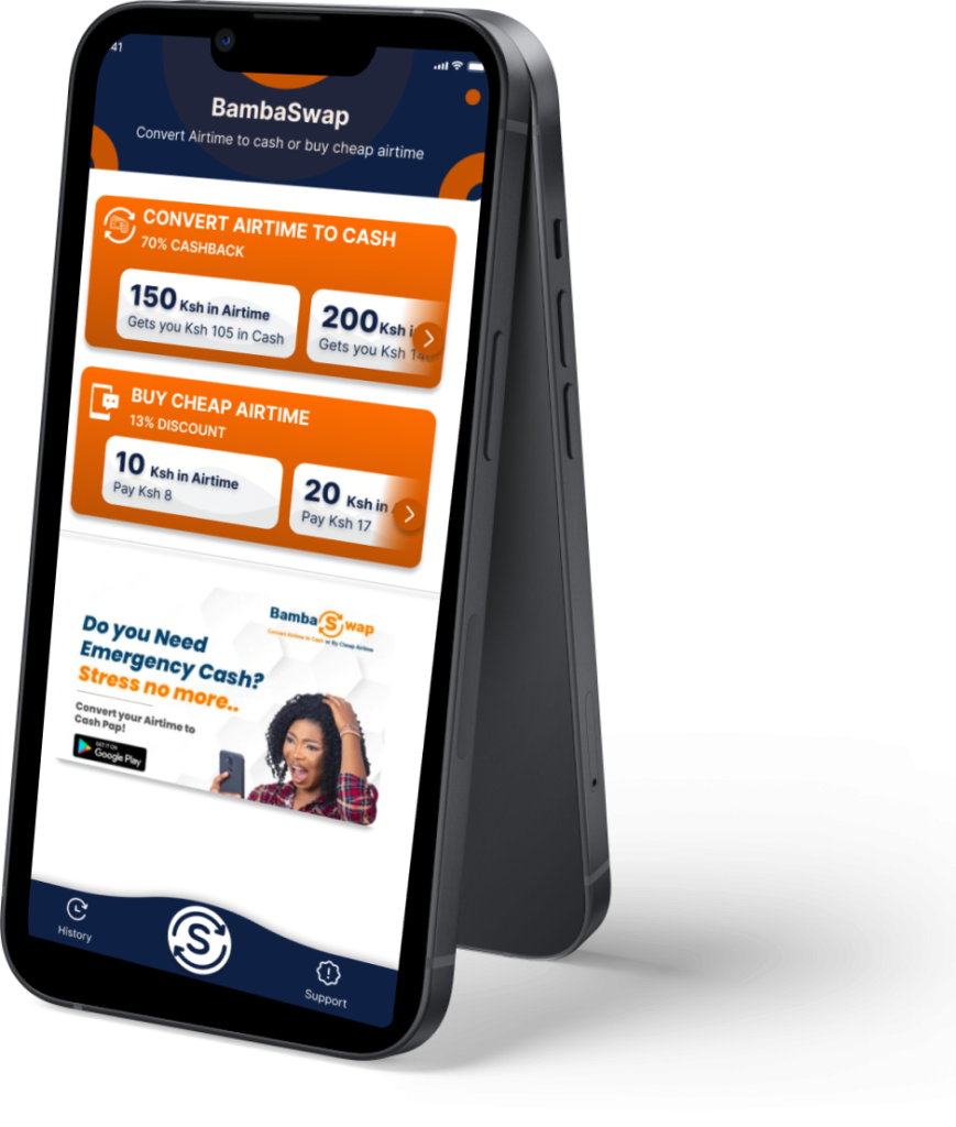
KEY FEATURES
To enhance the experience, I designed for these features ;
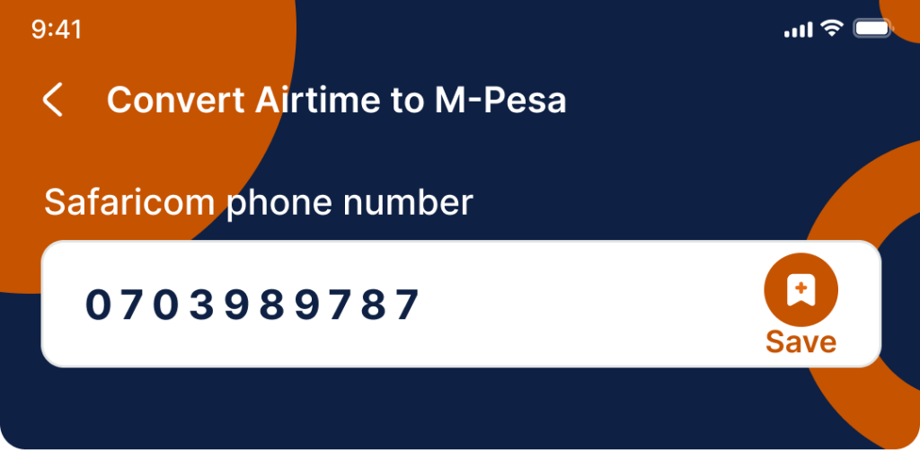
An adaptive UI that allowed predefined entries or selections as well as free entry values
Communication modules for success and failures
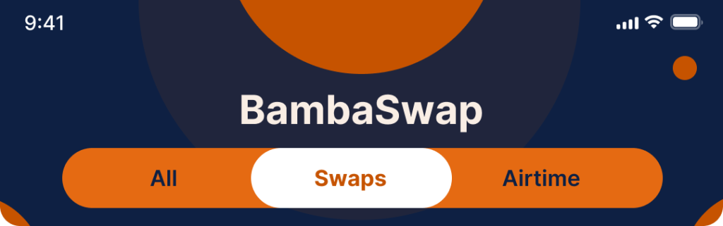
A transaction history display
A filter and smooth swipe navigation for the transaction history categories
An ability to save a default recipient
An ability to remember the customer and not subjected them to repetitive steps
An ability to capture and show the customer the balance they have to work with to help in their conversion
A structured about page to help them navigate informative pages and sections
VISUAL DESIGN
The visual design maintains brand identity while improving user experience:
Consistent branding across screens with headers
User-friendly colour scheme
Iconography for easy navigation
Friendly font selection
Motion and interaction design for responsiveness
TESTING AND IMPLEMENTATION
With an immersive and interactive prototype, we got feedback internally and externally as well by sharing the prototype. It also guided the developers on how to implement and execute the design as envisioned Once done, a build was provided internally and we got to experience, critic, rectify and provide further feedback. We engaged in continuous engagement and improvement of the services and the experience to business satisfaction.
RELEASE AND LAUNCH
The app was recently made available on PlayStore for android users and we are actively monitoring its performance and metrics
CONCLUSION
The project was an exciting one, allowing us to redefine an experience and make a convenient service much more friendly and in so doing, demonstrating the companies commitment to serving its customers The biggest challenge was accommodating technical challenges posed by the API’s to be consumed, which led to the design and experience changing a number of times. However, this allowed us to come up with a solution that would be seamless to the user and giving insight on what can be done in the next phase of the ever continuous growth