Case study · Equity Mobile
Equity Mobile guide and knowledge-base feature
Problem statement
For a considerable period, user experience (UX) wasn’t given priority in product development within Kenya. Consequently, customers encountered a spectrum of experiences, ranging from positive to negative. One prevalent negative experience was the challenge customers encountered in adapting to changes in their user experience.
Change management, particularly in the introduction of new features, experiences, and user interfaces, was frequently neglected. As a result, customers often felt unprepared and caught off guard by changes. They perceived updates as lacking consideration for their needs, leading to feelings of frustration and dissatisfaction.
The task
It’s increasingly evident that providing clear and concise information about changes, along with guidance on using new features, is crucial. Therefore, while redesigning the Equity mobile app for all subsidiaries, I adopted a proactive approach focused on delivering a high-quality experience to customers. This approach aimed to help users navigate the new app, guiding them through its functions and features.
We implemented quick guides to inform, educate, and entertain users. By the end of this process, users were equipped and familiar with the new features, proficient in navigating the interface, and, importantly, knowledgeable about where to find their financial and transaction details effectively.
The approach
In financial applications, transparency and accountability in conveying financial information are paramount for fostering a positive user experience.
To inform our approach, we collaborated with the UX research team to conduct competitor analysis and examine how other apps onboarded their customers. Armed with this insight, we engaged in brainstorming sessions to determine the most effective strategies for the Equity app.
Based on our research, we identified several common pain points among customers:
- They desire clarity on the whereabouts of their money.
- Customers seek to feel involved and considered throughout their interactions.
- There’s a desire for a sense of choice and engagement in decision-making processes.
- Customers value seeing tangible benefits or value in changes to fully appreciate them
The process
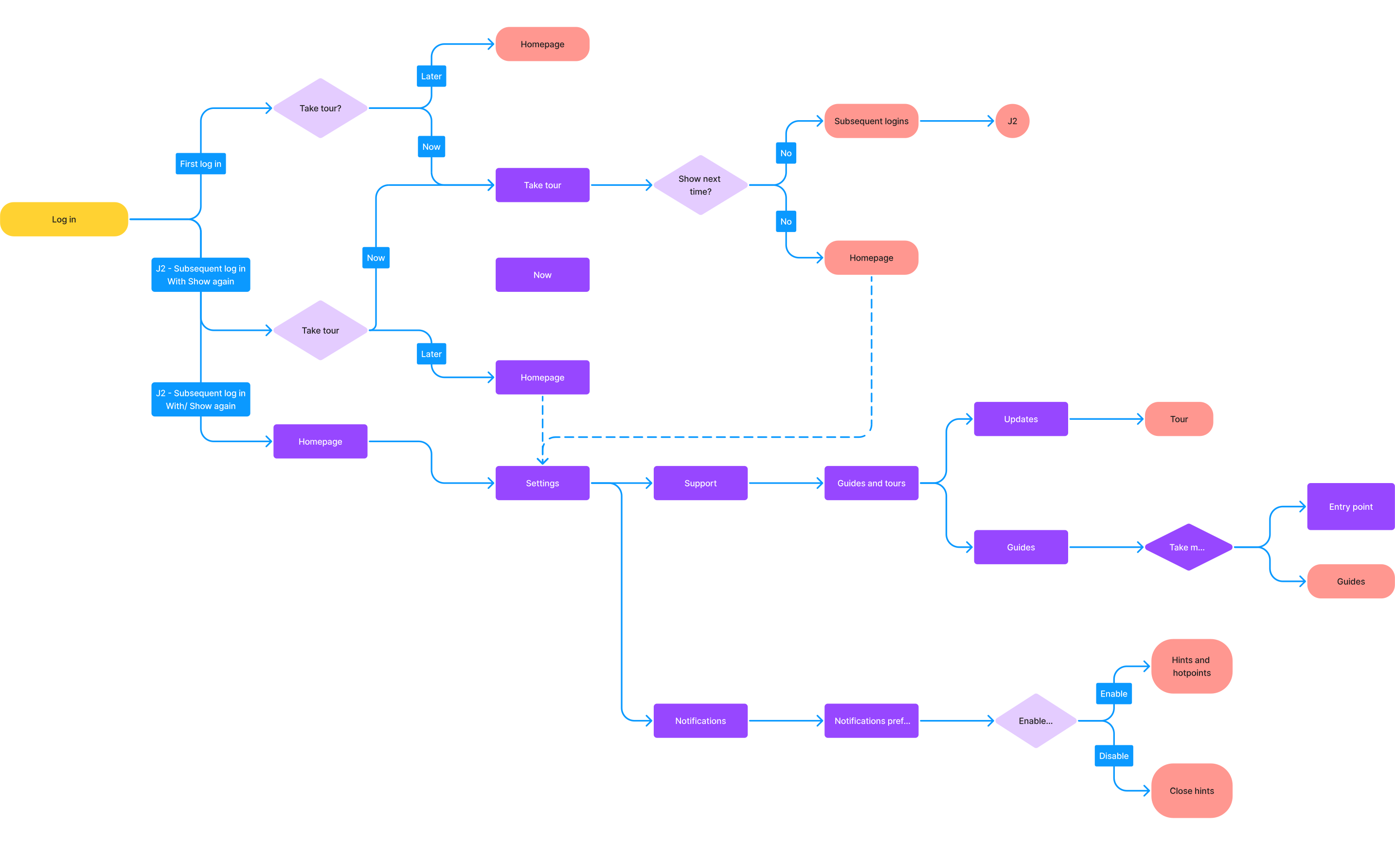
I mapped out user flows to visualise interactions and decisions, which proved instrumental in refining the design process. Utilising an existing design system expedited interface development, affording more time for prototyping. During prototyping, I focused on crafting interactive and immersive experiences with precise animations and practical interactions, such as scroll and carousel behaviours. The remarkable enhancements made to Figma’s prototyping features facilitated these capabilities.
Handling animations
The feature would utilise JSON Lottie files for the demo, while the remaining assets would be maintained within the app’s containers. Leveraging JSON Lottie files enabled us to showcase lightweight, scalable, and cloud-stored animations for the demo. Integrating these assets with Figma made it simple to embed them within the prototype. We crafted prototypes for both mobile and web platforms, guaranteeing usability for a broad audience.

This approach was highly feasible for several reasons:
- Lottie files are incredibly lightweight compared to videos and GIFs, as demonstrated by their motion and file sizes.
- They are scalable and can adapt to responsive view containers, as shown in the demo (scaling is optional).
- Storing JSON files on the cloud prevents overloading the app’s capacity.
- Developers only require the correct URL, thanks to the simple-language naming structure I implemented.
By integrating Figma with Lottie files, I embedded motion assets within the prototype seamlessly. I focused on developing prototypes for both mobile and web platforms to showcase experiences across both mediums. These prototypes were accessible via browser views or host applications like Figma Mirror, enabling users on both mobile and web platforms to engage with the feature.
Following extensive testing by various team members, we received encouraging feedback and made minor adjustments. Users showed interest in a knowledge base feature, suggesting the provision of quick guides and tours on how to perform certain functions, indicating that FAQs were not always effective.